Zero is a financial technology company based in the US
Audience: B2C
Type:
Campaign Title: Zero’s Website
What It Is
Zero is an emerging financial technology company that prides itself on having none of the annoying fees like traditional banks. Its website also has zero in common with its competitors, opting for transparency and simplicity instead of hidden service obligations and complex language.
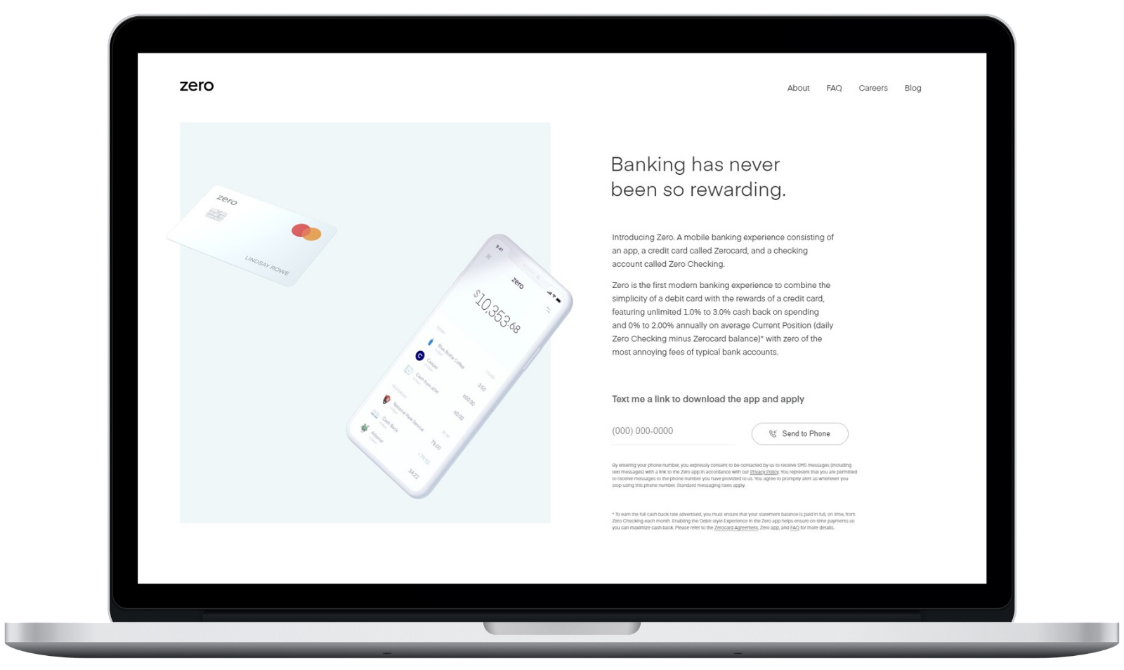
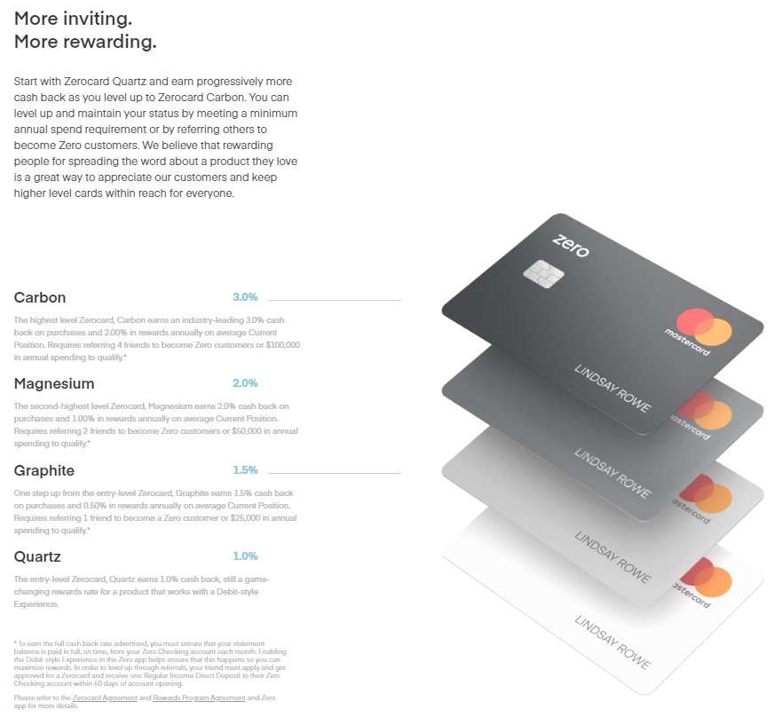
Its website - and business model - is built on simplicity. Zero pairs its straightforward copy with a stark white design and mix of images that shows exactly what the app, bank and card look like, as well as how they all work. Its interactive tool makes figuring out how much you'll save on yearly cash-back easy, while the FAQs allows anyone quickly find answers to their questions.

Why We Like It
The website is a perfect example of how hygiene content can change the perception of how a business is viewed by its customers. By leading with a clear-cut, no-frills introduction and offering an interactive tool to show prospects how the cash-back on its credit card works, Zero builds trust among its audience from the very start.

How We’d Add To It
Zero is flush with hygiene content but does little in the form of hub content, despite it being positioned well to do so. Regularly scheduled, relevant content can help the company organically connect with the audience it's trying to reach. Its website has the foundation set in stone; now it's time to furnish it.
Subscribe Here
You may also like...
256 | Sep 28, 2020
256 | Sep 20, 2020
256 | Sep 14, 2020


