Salesforce is a US-based Software-as-a-Service (SaaS) provider that primarily sells sales and marketing solutions.
Audience: B2B
Type: Hygiene: Basic content like landing pages and FAQs that provide customers with answers to their questions.
Campaign Title: Website Sitemap

What It Is
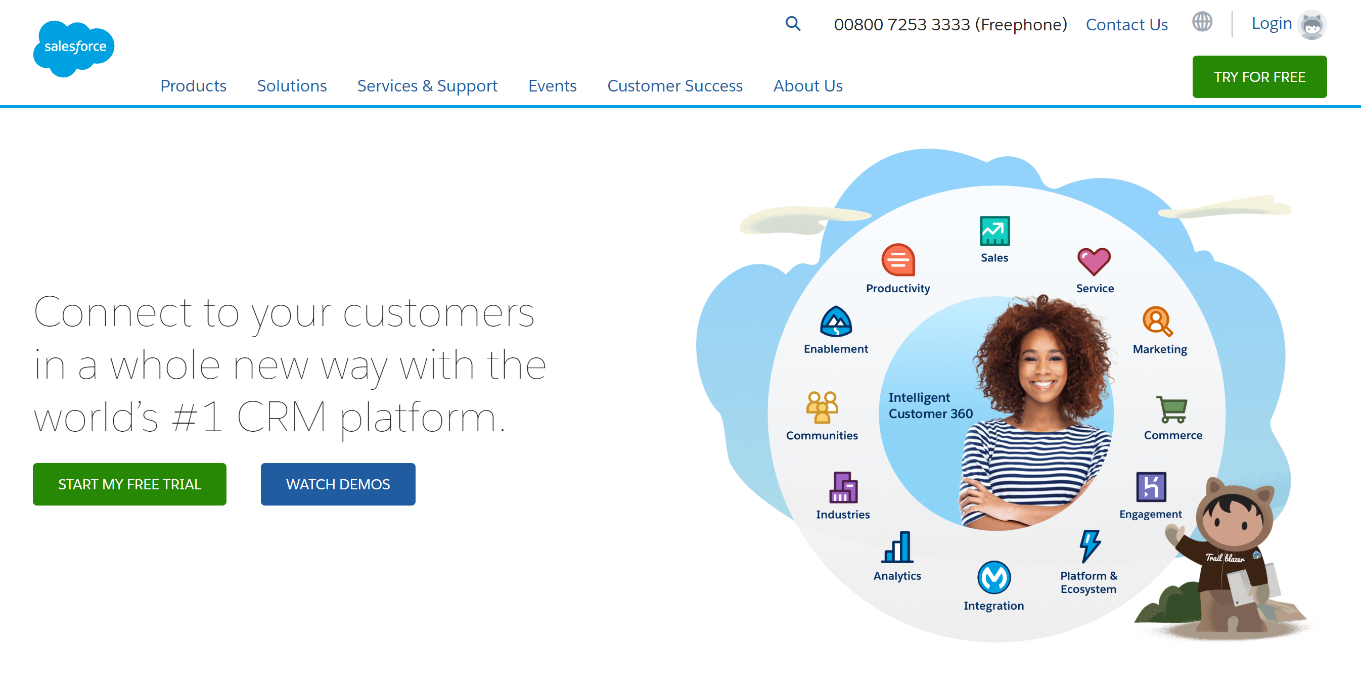
Salesforce is a massive business with an even seemingly larger set of SaaS solutions that it sells. Because of the volume of tools and platforms - all of which are uniquely created for a specific purpose or function - the company's website plays an important role in informing buyers of the various features and functionalities.
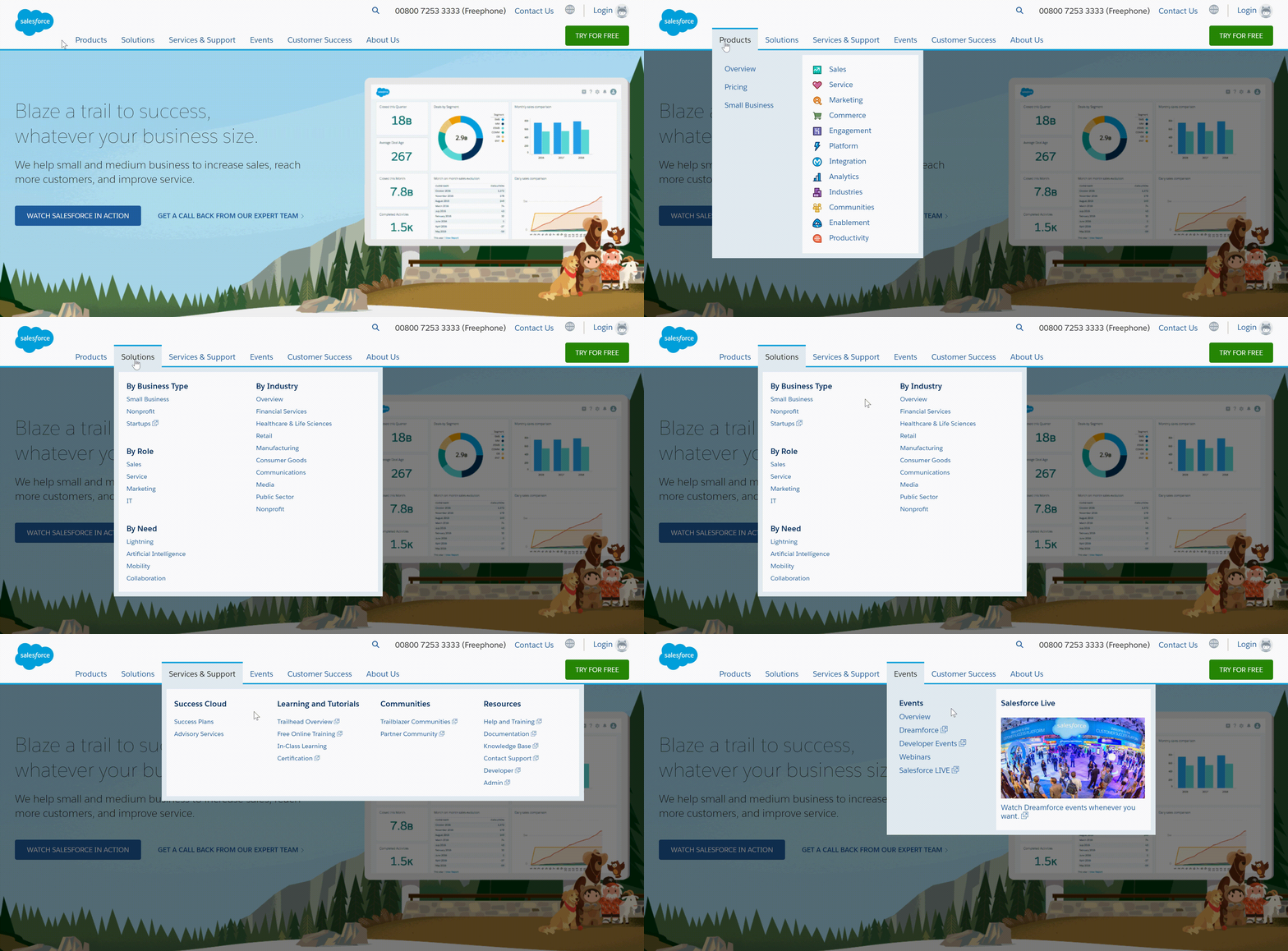
Salesforce's website sitemap does an excellent job of distilling the company's products and solutions given the challenge at hand. Represented by the primary navigation bar at the top, users are able to use the product overview menu to dive in-depth on any of the tools, or search for a solution that solves their challenge based on their business type, their role, their need or their industry.

Why We Like It
Salesforce made it easy for buyers to navigate through products and solutions based on a number of criteria ranging from as specific as their role to as wide as their business type. We can't overlook how simple it is to view other important areas of the website as well, like services and support, case studies and events.
How We’d Add To It
Getting rid of the second navigation bar that drops down on the left in product pages could create a cleaner look and allow them to use more real estate on the page. While we see why they'd want to lock demo videos behind a gate, making stripped-down versions available would add to the value of the landing pages.
Subscribe Here
You may also like...
256 | Dec 14, 2020
256 | Dec 6, 2020
256 | Nov 8, 2020


