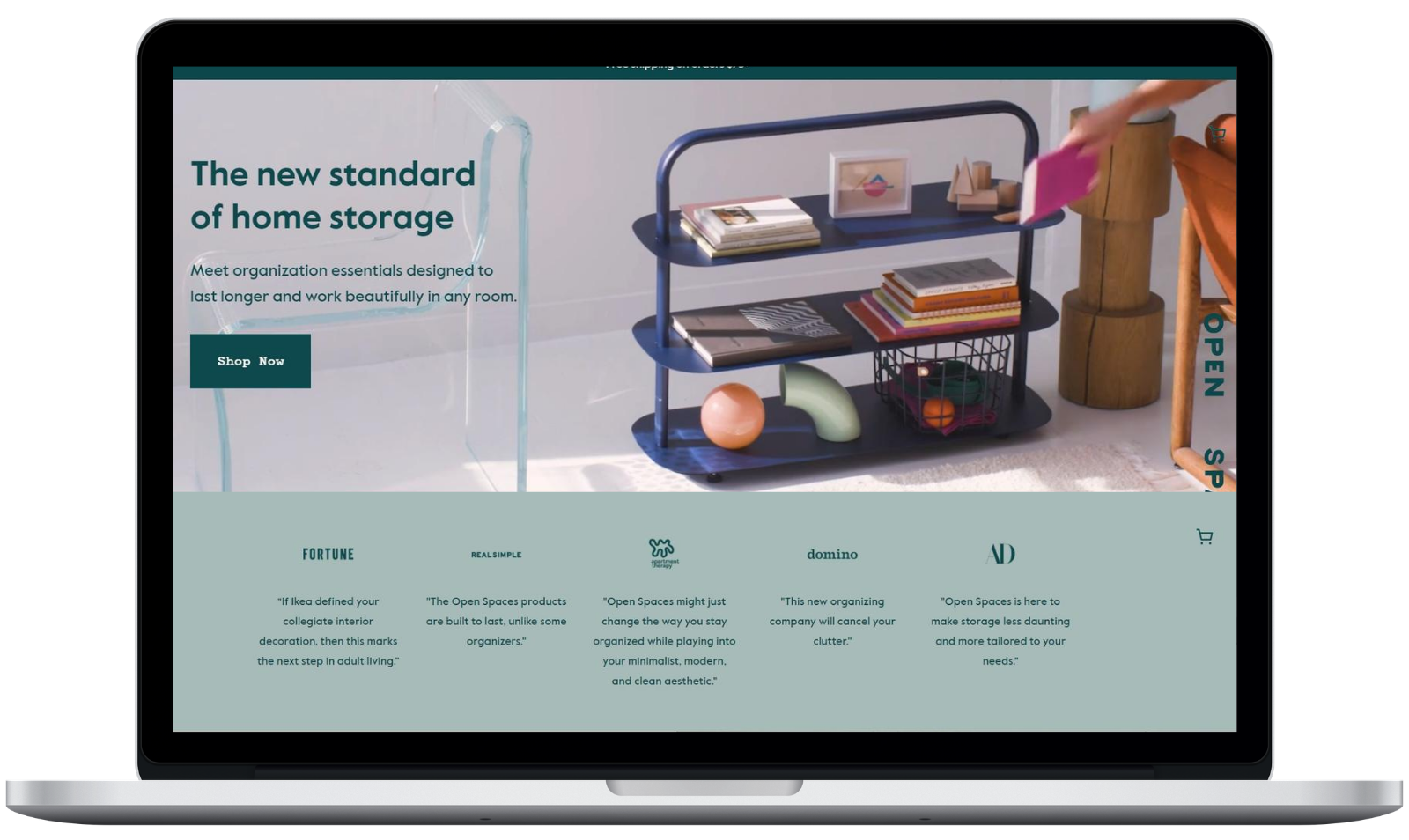
Open Spaces creates products to aid organisation in bathrooms, bedrooms and kitchens.
Audience: B2C
Industry: FMCG
Type: Hygiene
Campaign Title: Open Spaces
What It Is
Open Spaces, a manufacturer for organisational products, leaves no open space on its website - everything is there for a reason. It starts with the eye-catching, oddly satisfying video that sits above the fold, which wastes no time in showing the users the products and how they look in action.
Every aspect of the website from that point on is uncluttered, with clearly visible text and invisible but clearly defined boundaries. It's easy to shop for what you need based on the product or the room in question, and it's even easier to get information on the company or how shoppers can get the most value from what they buy.

Why We Like It
If you haven't noticed, here at 256 we're big fans of large videos playing above the fold on the website. But Open Space's video is particularly striking as it instils a sense of calm, showing visitors how easy it is to keep life organised. The rest of the website's design lends itself to the same effect.
How We’d Add To It
Open Spaces nails many of the hygiene aspects of its website, but there's space for the company to make its webpage more useful. With a focus on hub content, the company would be able to present itself as the premier destination for organisation. Right now, there's not much available apart from the guide to keep users on the pages for very long.
Subscribe Here
You may also like...
256 | Sep 28, 2020
256 | Sep 20, 2020
256 | Sep 14, 2020


