First dates and landing pages – 7 things to stop you clicking

Posted by Karen Hesse
June 20th, 2014
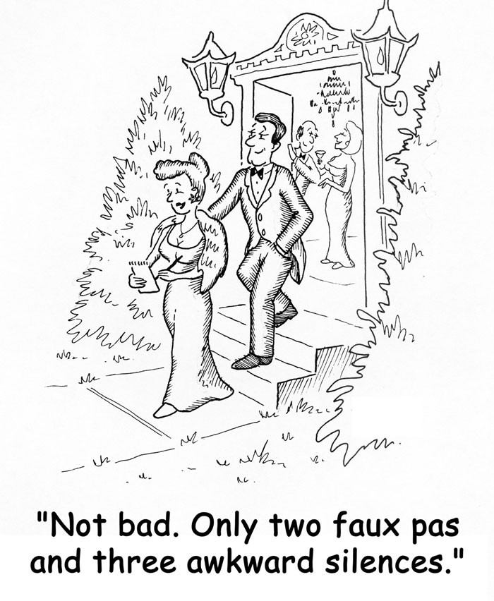
It’s been a few years since I’ve been on the dating scene but some memories last a lifetime. Sometimes a first date is the start of something special. And other times you're waiting on your friend to ‘fake call’ after an hour, so you can feign an emergency and exit stage left.
It's not that complicated really. On your first date you either click or you don't. But what has all this got to do with digital marketing? Quite a lot as it happens. If you think of your landing pages as a first date you will have a better chance of getting your browsers back for a second one. According to Hubspot 5%-15% of people will respond to your landing page call to action. But that figure can go right down or up depending on your behaviour.
Check out these 7 things that bad dates and bad landing pages have in common.
Bad Date 1: When first impressions are your last
The first rule of dating is to 'be yourself' - just make sure it's your best self. You wouldn't turn up for a hot date dressed by your granny or little sister so make sure your landing page doesn’t look like it was designed by them. Your landing page should look like it belongs on your website and not like it was borrowed for the night like the landing page equivalent of Cyrano de Bergerac.
On a first date you’ll make a good impression (or not) in the first five minutes. But if things start off badly, you probably have another 55 minutes to retrieve the situation. Online your landing page has just 6 seconds to persuade your browser to hang around.
Bad Date 2: When it feels more like interrogation than interest
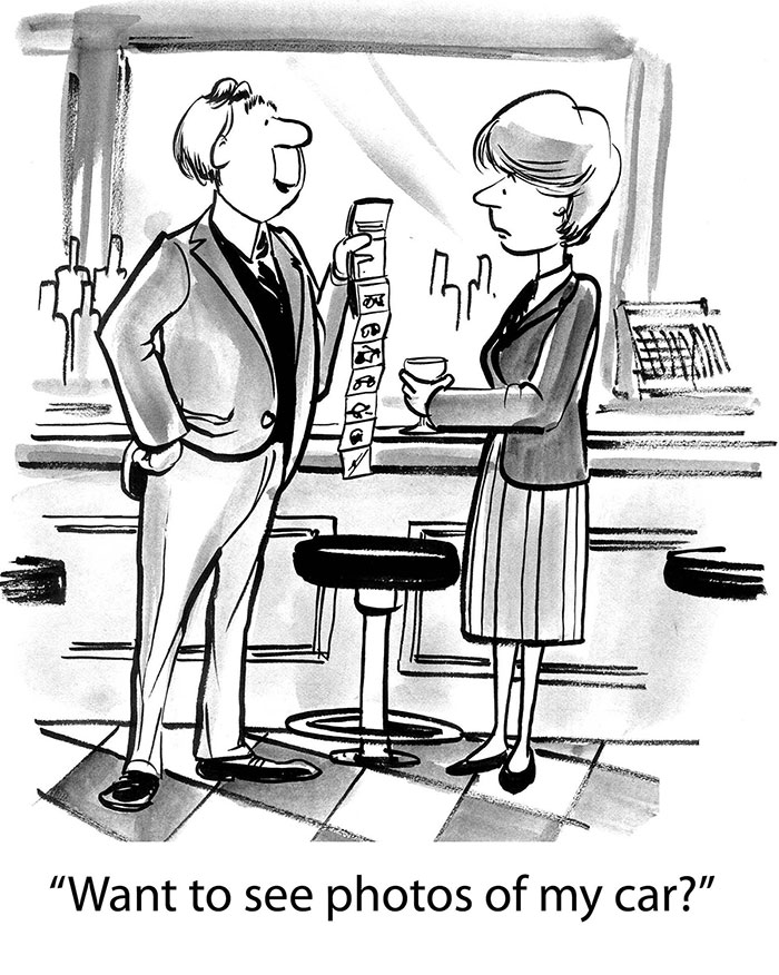
Imagine you walk into the bar, see a handsome man perched on a stool, he waves over and he’s actually waving at you. This is looking good. You say hello and within the first five minutes he peppers you with 20 questions. What’s your favourite food, where did you go to college, what’s your pet dog’s name? You can’t wait until he goes to the bar so you can slip quietly out the door never to be seen again.
When it comes to your landing page remember that interrogating your prospects is just downright rude, so don’t scare them off trying to capture their data with too many questions. Depending on your offer, if you capture an email address and their name that’s enough. You may get a chance to court them later on.
Bad Date 3: When he just won’t stop talking about himself

This is the opposite to Bad Date 2 but will have the same outcome, no second date. You go on a blind date and the guy just doesn’t stop talking about himself - his conquests, his achievements, his all-round brilliance. If narcissism was an Olympic sport he’d be on the winner’s podium.
Do not use your landing page to boast about how incredible your company is and ignore what the browser wants. Frankly, we’re more interested in our own problems than how amazing you are.
Bad Date 4: When it feels like something is just not right
So you turn up on your first date and within minutes something just doesn’t feel right. The date seems shifty. You just can’t put your finger on it but one thing’s for certain, you don’t trust him. This bad date is the landing page equivalent of ‘I’m going to take your details and stalk you, or maybe even sell your email address to some dodgy spammer'.
Present the content on your landing pages in a clear and professional manner. Let prospects know that you will never share their information. Include a link to your privacy policy and ensure your company’s phone details and contact information are easily available on your site.
Bad Date 5: When the date looks nothing like they did in the photo
If you've ever done online dating you'll know that the Brad Pitt lookalike you saw in the online photo rarely turns up for the date. This is the same as over promising to get people to your landing page. Keep it real by making sure to match the headline on your landing page to the call to action that got your browsers there in the first place. It also helps to include a strong image of your offer prominently on the page. But make sure the browser will recognise what they signed up for when they download it.
Bad Date 6: When he's all over the place
The messy landing page is the equivalent of having one drink too many on a first date. Remove the navigation bar at the top of the page to reduce distractions and to help keep your browser on your page longer. Embrace the use of white space, and remember, if the landing page looks all over the place, the first date is likely to be short lived.
Bad Date 7: When you just don’t click

Sometimes on a first date you just don't click. At its very simplest level your date just isn't offering what you want. Whether that's amazing conversation, humour, good looks or an interest in Gaelic Football, they're just not doing it for you. To give your landing page the best chance of converting you need a compelling offer that's crystal clear. Set out the benefits of the offer in a compelling headline. Instead of saying 'This will save you money' specify how much. 'This will save you €1,500 a year' will have a lot more impact than a more generic approach. Follow your headline with a short paragraph of copy setting up the call to action and include a bullet pointed list of four to five additional features of the offer underneath. Don't overdo the copy, we don't have all day. Remember, for the best chance of success your offer needs to spark an emotional response from the browser. The browser should feel "I have to sign up now because this offer will help me solve a problem, or at the very least entertain me."
After the date - what next?
After the date it's polite to send a thank you text. If you've converted a prospect on your landing page make sure the 'Thank You' screen pops up and that it aligns with your brand's look and tone. If the date has gone well you may want to meet again, but your date will be running for the hills if you suddenly bombard them with a torrent of calls and emails. Needy is just not attractive and the same is true for prospects converting from your landing pages. By all means follow up to develop the relationship and move them along the sales pipeline - just don't become a stalker.
Dating and landing pages - it's a numbers game
If you've had a first date and it didn't work out the dating experts suggest you get out there and have as many dates as possible to find your perfect match. When it comes to landing pages it's also a numbers game. Hubspot research suggests that companies with 30 or more landing pages create seven times more leads than companies with less than ten. Remember, just like dating, no matter how great your offer, sometimes your landing page converts are just not destined to marry you.
P.S. 256 Media is gathering examples of good, bad and ugly landing pages to share with our e-zine subscribers.
If you'd like to be first in line to see the landing page 'post of shame' sign up for our e-zine below. (And we won't spam you. Promise!)
P.P.S. The guys in this post could just as easily be girls. Obvs.


Previous Post
Take the 60 Second Content Marketing Quiz
Next Post

How Kraft Foods bakes Content Marketing into its DNA - 3 lessons from day 1 at Content Marketing World
Subscribe Here
You may also like...
Nicole Thomsen | Dec 11, 2023
Nicole Thomsen | Nov 6, 2023
Nadia Reckmann | Nov 2, 2023


